Theme
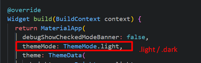
1. Mode
Mode ini penting untuk user yang memperhatikan dark color yang diset ke Dark Mode. Kita cukup setup rule theme untuk masing masing mode, di property yang disediakan yaitu theme untuk Light dan darkTheme untuk dark. Jika tidak ingin menggunakan kedua, hanya mengguankan mode salah satu aja dan fixed theme maka cukup gunakan property theme dan set brightness nya atau bisa di copy & modifiy settingan bawaannya untuk light/dark saja.

2. Color
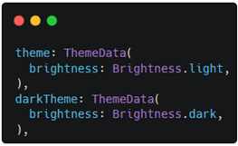
Setup warna utama dibagi 3 atau biasa disebut color palette yaitu primary, secondary, dan tertiary (ascent). Diluar warna utama, bisa juga set warna untuk amsing-masing widget seperti background, dialog, button, text, dll.
theme: ThemeData(
  brightness: Brightness.light,
  primaryColor: Colors.purple,
  scaffoldBackgroundColor: Colors.white,
  colorScheme: const ColorScheme.light(
    primary: Colors.purple,
    secondary: Colors.amber,
    tertiary: Colors.cyan,
  ),
),
darkTheme: ThemeData(
  brightness: Brightness.dark,
  primaryColor: Colors.purple,
  scaffoldBackgroundColor: Colors.black,
  colorScheme: const ColorScheme.dark(
    primary: Colors.purple,
    secondary: Colors.amber,
    tertiary: Colors.cyan,
  ),
),
Cara penggunaannya menggunakan class Theme.
Center(
  child: Container(
    height: 100,
    width: 100,
    color: Theme.of(context).primaryColor,
  ),
),
Center(
  child: Container(
    height: 100,
    width: 100,
    color: Theme.of(context).colorScheme.secondary,
  ),
),
Center(
  child: Container(
    height: 100,
    width: 100,
    color: Theme.of(context).colorScheme.onBackground,
  ),
),
Center(
  child: Container(
    height: 100,
    width: 100,
    color: Theme.of(context).colorScheme.tertiary,
  ),
),
 |  |
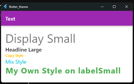
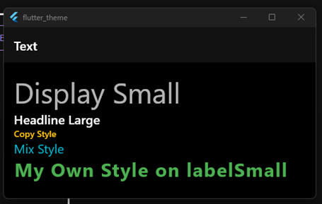
3. Text
Bisa custom sendiri dengan mendaftarkan style text di theme.
textTheme: const TextTheme(
  labelSmall: TextStyle(
    fontSize: 30,
    color: Colors.green,
    fontWeight: FontWeight.bold,
  ),
),
Text(
  'Display Small',
  style: Theme.of(context).textTheme.displaySmall,
),
Text(
  'Headline Large',
  style: Theme.of(context).textTheme.titleLarge,
),
Text(
  'Copy Style',
  style: Theme.of(context).textTheme.labelLarge!.copyWith(
        color: Colors.amber,
      ),
),
Text(
  'Mix Style',
  style: TextStyle(
    fontSize: Theme.of(context).textTheme.titleLarge!.fontSize,
    color: Theme.of(context).colorScheme.tertiary,
  ),
),
Text(
  'My Own Style on labelSmall',
  style: Theme.of(context).textTheme.labelSmall,
),
 |  |
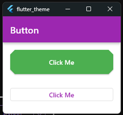
4. Button
elevatedButtonTheme: ElevatedButtonThemeData(
  style: ButtonStyle(
    backgroundColor: const MaterialStatePropertyAll(Colors.green),
    foregroundColor: const MaterialStatePropertyAll(Colors.white),
    minimumSize: const MaterialStatePropertyAll(
      Size.fromHeight(60),
    ),
    shape: MaterialStatePropertyAll(
      BeveledRectangleBorder(
        borderRadius: BorderRadius.circular(10),
      ),
    ),
  ),
),
ElevatedButton(
  onPressed: () {},
  child: const Text('Click Me'),
),
const SizedBox(height: 30),
// without custom theme / follow default
OutlinedButton(
  onPressed: () {},
  child: const Text('Click Me'),
),
 |  |
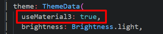
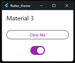
5. Material 3
Cukup pakai property useMaterial3 dan jadikan true.
Ada perubahan di settingan default untuk style button dan lainnya. Contoh, button yang awalnya small corner sehingga terlihat jelas sudut nya lancip, sekarang sudah berubah jadi setengah lingkaran diujung button.
OutlinedButton(
  onPressed: () {},
  child: const Text('Click Me'),
),
const SizedBox(height: 20),
Switch(
  value: true,
  onChanged: (value) {},
),
| Material 2 | Material 3 |
|---|---|
  |   |